“THE ROPE OF PEARLS PRINT”

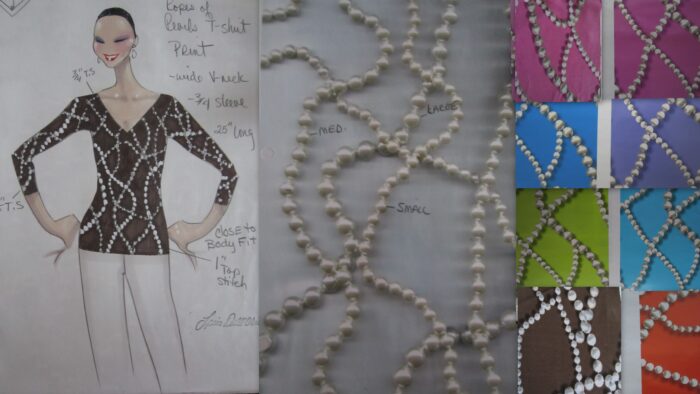
…………………..Every season we added a print or two to each group of clothing to work as a coordinate or as a stand alone piece. We would call in 5 or 6 different print companies to look at the lines. These were companies from England, Italy and the USA that had a team of print designers in each country who created prints to sell. Many times I had an idea for a print and had our own team develop it…..That was the case for “The Rope Of Pearls” print. I took some strands of pearls and laid them on a printer. I tried many different layouts until I chose one that I liked the best. The ivory pearls above is the layout I chose for the print. Then I gave it to the print developer. Elaine had 3 or 4 “print people” who had different jobs developing prints. I always worked with the same person, Katherine. She took my photocopy and developed a layout and repeat. Then she planned out the amount of screens it would take to achieve the look, and the amount of colors that would be needed. When we agreed on the final amount of screens needed she would start to create different color combinations on the computer. That was the fun part. We would sit together and choose colors from a book that was part of the computer program. There were literally hundreds of colors to choose from. Above is just a sampling of the colors we developed. The hard part was picking two or three depending on how many the buyer wanted to purchase.
Continue Reading “THE ROPE OF PEARLS PRINT”

“MARCH 10 DESIGNER’S GALLERY”

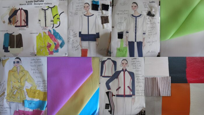
……………………The March 10 Designer Gallery had some fun pieces……Starting at the bottom left….a new Cotton stretch TRENCH JACKET. The double breasted jacket came in three fun colors….Yellow, Peony Pink and Turquoise. All three jackets had white details…white poker chip buttons, white cotton under the collar, the underside of the sleeve straps, and one side of the self fabric tie belt were all in white cotton . They were fully lined. A great way to start a colorful spring 2010…..The next jacket was an on trend “BASEBALL” jacket in leather and knit. The raglan sleeves were in fully fashioned ribbed knit, and the body, collar and contrast trims were all in leather….The inspiration came from the shoe at the lower left of the sketch. The Red, White and Blue jacket had Navy rib sleeves with White and Red stripe rib borders. The White leather jacket had  Red piping and red plastic exposed teeth zippers down the front and zipper pockets. Navy leather bands bordered the red zip pockets. The bottom had a navy leather band with red piping. What looked like a simple jacket had many different aspects and details to keep straight…It was a fun jacket to wear with  jeans. khaki or Ponte pants…..The second combination in the baseball jacket was Ivory, Orange and Tan…….Above is a georgette blouse. I’m a strong believer in a feminine blouse to broaden and complete a women’s wardrobe……They can be more versatile than what you may think and most of the time need no more care than a sweater or tee. This georgette blouse had contrast bands and ruffle trims. This button front blouse was great with dress pants and a skirt, and looked equally wonderful with jeans…..The color block tunic sweater was made in cotton/acrylic….It came in Mocha and Ivory and Turquoise and Navy……..Easy and comfortable…….a timeless top that is always in style.

Continue Reading “MARCH 10 DESIGNER’S GALLERY”

“MARCH 10”

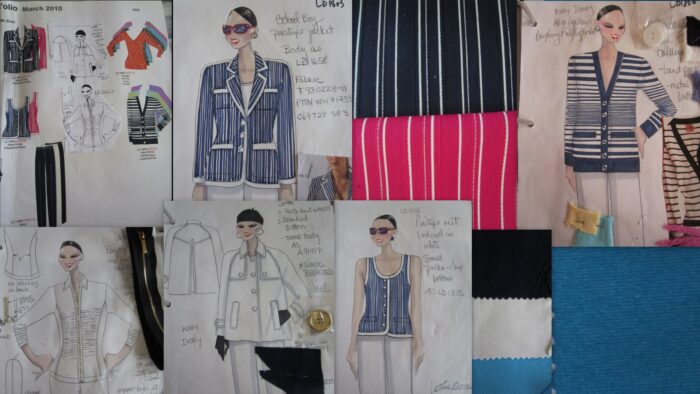
………………………March 10 continued with a very chic “SCHOOL BOY” or “ETON”  jacket. This one was a woven stripe made in a Cotton./Poly/Span blend. The entire three button jacket was banded in White cotton twill…..The collar and lapel, the front, the hems of the bottom and sleeves, and the four pocket bands were in contrast white. There was even a white stripe of cotton that started at the neckline across the shoulder seam and down the center of the arm.. It came in Navy and White and Raspberry with White. I actually didn’t want the Raspberry. I originally had the navy with white and BURGUNDY with white which I think looked much more authentic…but “they” felt it was too dark. With all the white it was no darker than the navy and IMHO much more sophisticated……but they wrote the orders so I had to relinquish. As it turns out the navy sold very well with the raspberry a dismal second. I don’t know if the Burgundy would have done better, but I like to think it would have….The scoop neck vest in the stripe with the contrast bands coordinated with the jacket. It was great on its’ own, and looked wonderful under white jackets too…….A white and navy cotton twill pant was also part of the assortment…..The “REGATTA” stripe cardigan in the the cotton/acrylic blend was part of the “school boy” look…It came in Navy/White, Yellow/Aqua and Raspberry Pink/Lavender………The jacket to the left was the same as the FALL BOUCLE only in COTTON. It came in Navy and Ivory with classic four hole rimmed gold buttons………The shirt at the extreme left was in a Rayon/Span….It had a zip front. It had shirring on either side of the front placket and from the princess seams. It also had shirring on the sleeves. It came in Black and Turquoise. I really wasn’t sure if this was a style for plus sizes, because it had to be very fitted for the style to look right…….right??? However, it was the plus sizes that sold out first….so what do I know!

Continue Reading “MARCH 10”

“MARCH 10 CON’T”

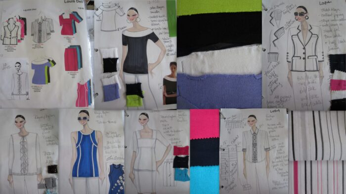
…………………….March was always the official start to spring. In many areas of the country Spring was in full bloom and the temperatures were on the way up……The cotton/acrylic sweater on the top row had a wide contrast band framing the ballet neck line. It had a half raglan short sleeve and a semi fitted body. The band at the top gave the look of an off the shoulder sweater. It was done in White/Black, Lavender/White and Lime/Navy……The next blazer had wonderful “spectator” details. It was in stretch cotton with contrast cotton piping. It had poker chip buttons with contrast color tread matching the body. The 3/4 sleeves had three working buttons so the sleeve could be turned back revealing a fine stripe lining. The under collar and the half back lining were also in the stripe fabric. The jacket came in Ivory/Navy, Black/White and Bright Pink/White. The shirt below was made in the same Cotton/Nylon/Metallic pinstripe that I used for the jacket linings and facings. This was the linings and the shirt would all match for a custom designer look….The shirt had a classic shirt collar and placket button front. On either side of the front placket were pressed pleats about 1 1/4 inches wide with 5/8ths inch deep pleats. At the bottom of the 3/4 length sleeve was a buttoned band and the same pressed pleats.. The shirt came in White/Black/Grey and a fine Silver Metallic stripe. The second color was White/Black/ Bright Pink and Silver metallic thread…..The next two pieces, the sweater top and skirt were in the ENR WK. They both had TUBULAR TRIM DETAILS. The elbow length sleeves were attached to a square neck body that also had a wide band across the bust for an Empire look. The body was shaped with tubular trimmed seams. The pull-on skirt also had tubular trim details. Both pieces came in Navy, Raspberry and Turquoise…..The next sweater was inspired by exercise and scuba tops. It was detailed with tubular trims and bandings……The colors were Bright Pink/White, French Blue/Black and Black/White. This sweater was made in ENR WK [still not called WK yet]……The next sweater was was in WK with fine rib starts. It had a faux button front with pearlized buttons. It had circular ruffles on either side of the the placket. Something that looks so simple was not. It is very difficult to make circular ruffles without seams in the knit, and still make sure they lay flat! The colors were Pale Aqua and a soft Silver Grey.

Continue Reading “MARCH 10 CON’T”